Navigating the world of web design can be a daunting task, especially for those who are new to the field. The difference between a well-designed website and a poorly designed one can be the make-or-break factor in the success of a business or personal venture. In this comprehensive article, we will explore the key elements that distinguish bad web design from good web design, with a focus on the main keyword: “bad vs. good design.”
Understanding the Fundamentals of Web Design

Layout and Structure
The layout and structure of a website are the foundation upon which the entire design is built. A well-structured layout should be intuitive, easy to navigate, and visually appealing. This includes the arrangement of elements on the page, the use of white space, and the overall flow of the content.
Good Layout and Structure
- Consistent and organized structure
- Effective use of white space to create a balanced and uncluttered design
- Clear hierarchy and visual cues to guide the user’s eye
- Responsive design that adapts to different screen sizes and devices
Bad Layout and Structure
- Cluttered and disorganized page layout
- Lack of white space, resulting in a busy and overwhelming appearance
- Unclear hierarchy and visual cues, making it difficult for users to navigate
- Non-responsive design that may appear distorted or difficult to use on mobile devices
Typography and Readability
Typography plays a crucial role in the overall aesthetics and usability of a website. Choosing the right font, size, and spacing can make a significant difference in the ease of reading and the overall impression of the website.
Good Typography and Readability
- Consistent and visually appealing font choices
- Appropriate font sizes for headings, body text, and other elements
- Proper line spacing and paragraph spacing for optimal readability
- Effective use of contrast between text and background to ensure high legibility
Bad Typography and Readability
- Inconsistent or inappropriate font choices
- Font sizes that are too small or too large, making the content difficult to read
- Inadequate line spacing or paragraph spacing, resulting in a cluttered appearance
- Low contrast between text and background, reducing readability
Color Palette and Aesthetics

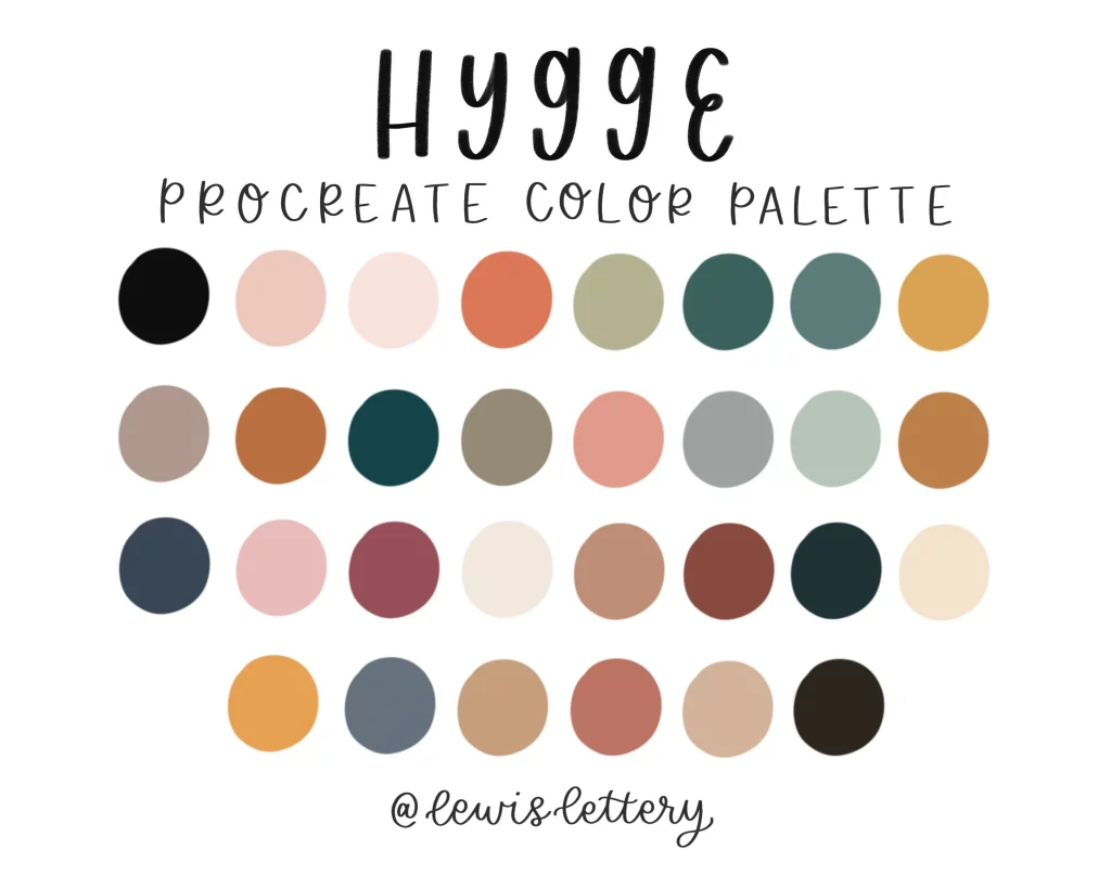
The color palette of a website can have a significant impact on the overall aesthetic and user experience. Choosing the right colors, and using them effectively, can create a visually appealing and cohesive design.
Good Color Palette and Aesthetics
- Consistent and complementary color scheme
- Appropriate use of color to create visual hierarchy and emphasis
- Effective use of color to enhance the brand identity and overall aesthetic
- Accessibility considerations, ensuring high contrast for readability
Bad Color Palette and Aesthetics
- Inconsistent or clashing color choices
- Overuse of bright or vibrant colors, resulting in a busy and distracting appearance
- Lack of contrast between elements, making it difficult for users to distinguish content
- Color choices that do not align with the brand identity or overall aesthetic
Good Color Palette and Aesthetics:
Bad Color Palette and Aesthetics:
Responsive Design and Mobile Optimization
In today’s digital landscape, where users access websites on a variety of devices, responsive design and mobile optimization have become essential elements of good web design.
Good Responsive Design and Mobile Optimization
- Seamless adaptation of the website layout and content to different screen sizes and devices
- Intuitive and user-friendly navigation on mobile devices
- Optimized images, videos, and other media for efficient loading on mobile networks
- Consistent and cohesive user experience across desktop and mobile platforms
Bad Responsive Design and Mobile Optimization
- Lack of responsive design, resulting in a poor user experience on mobile devices
- Difficult or confusing navigation on mobile devices
- Slow loading times due to unoptimized media and content
- Inconsistent or disparate user experience between desktop and mobile versions of the website
Usability and Accessibility

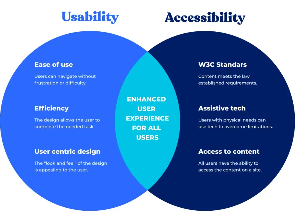
Usability and accessibility are critical factors in ensuring that a website is effective and inclusive for all users, regardless of their abilities or device preferences.
Good Usability and Accessibility
- Intuitive and user-friendly navigation, with clear information architecture
- Accessible design elements, such as high-contrast content and keyboard-navigable functionality
- Adherence to web accessibility guidelines (e.g., WCAG) for inclusivity
- Consistent and predictable user experience across the website
Bad Usability and Accessibility
- Confusing or unintuitive navigation, making it difficult for users to find what they need
- Poor accessibility features, limiting the website’s usability for users with disabilities
- Lack of adherence to web accessibility guidelines, resulting in an exclusive user experience
- Inconsistent or unpredictable user experience, causing frustration and confusion
Good Usability and Accessibility:
Bad Usability and Accessibility:
Content and Engagement

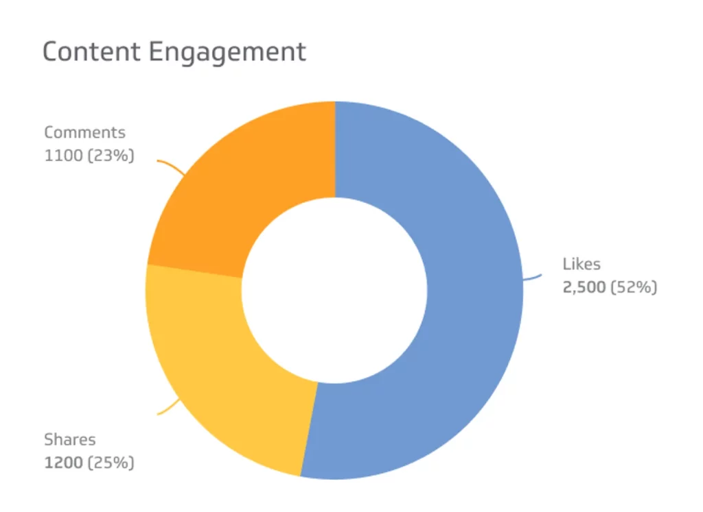
The content and engagement elements of a website can greatly influence the user experience and the overall success of the website.
Good Content and Engagement
- Informative, engaging, and well-organized content that meets the user’s needs
- Effective use of multimedia, such as images, videos, and interactive elements, to enhance the user experience
- Opportunities for user interaction and engagement, such as calls-to-action, forms, or social media integration
- Consistent tone and voice that aligns with the brand and target audience
Bad Content and Engagement
- Poorly written, irrelevant, or disorganized content that fails to address the user’s needs
- Lack of multimedia or interactive elements, resulting in a static and uninspiring user experience
- Limited opportunities for user interaction and engagement, reducing the website’s ability to capture leads or encourage conversions
- Inconsistent or inappropriate tone and voice that does not resonate with the target audience
Conclusion
In conclusion, the difference between bad and good web design is crucial in determining the success and user experience of a website. By understanding the key elements of layout and structure, typography and readability, color palette and aesthetics, responsive design and mobile optimization, usability and accessibility, and content and engagement, website designers and owners can create a website that not only looks visually appealing but also provides a seamless and inclusive user experience. By adhering to best practices and continuously evaluating and improving the design, businesses and individuals can ensure that their website remains a valuable asset and a reflection of their brand’s identity and values.


